

Notes on Colour: Pretty in Pink

“I believe in pink.” — Audrey Hepburn

Welcome to Notes on Colour, where I explore the colours that inspire TINKALINK — how I use them, what I pair them with, and how they can transform a room, a table or simply a mood.

Pink has come a long way from its sugary reputation.
From the palest blush and faded rose to juicy watermelon, raspberry and unapologetic hot pink, there are so many sides to this colour. Pink can be soft and comforting, romantic and nostalgic, or joyful, confident and full of energy. I think that’s probably why I love playing with pink so much.
More than a pretty face

The colour pink is often linked with compassion, optimism and care, making it a lovely choice for gifts or spaces where you want people to feel relaxed and welcome.

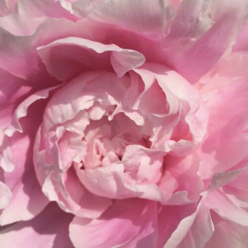
As ever, the shade makes all the difference. Blush and faded rose can feel soft and comforting, whilst brighter raspberry and bubblegum pinks bring playfulness and energy. Turn up the saturation further and hot pink becomes an instant mood boost.

What colours go well with pink?

Perhaps the better question is, what mood are you trying to create?

If you want something soft and restful, blush pink works brilliantly with warm cream, powder blue and gentle greens. For romance, deepen the palette with burgundy, plum or layers of dusky rose.

For something more playful, turn the saturation up. Hot pink and tomato red feel joyful and confident together, whilst orange brings even more sunshine to the mix. Raspberry or fuchsia with cobalt blue is bold and very difficult to ignore.

And then there are the combinations that give pink a more sophisticated edge, like dusty pink with chocolate brown. Warm, contemporary and fabulously indulgent.

I think it’s not so much about what colour goes well with pink, but what pink am I feeling today?!

Pink on the table

Adding pink to table settings can be so much fun because you can take the colour in so many different directions.

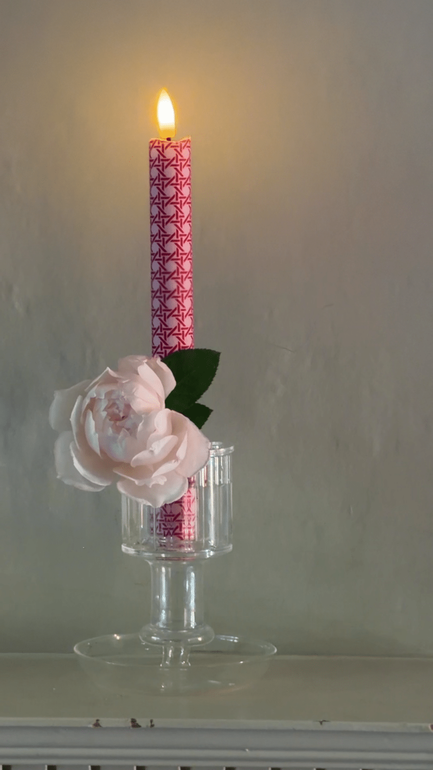
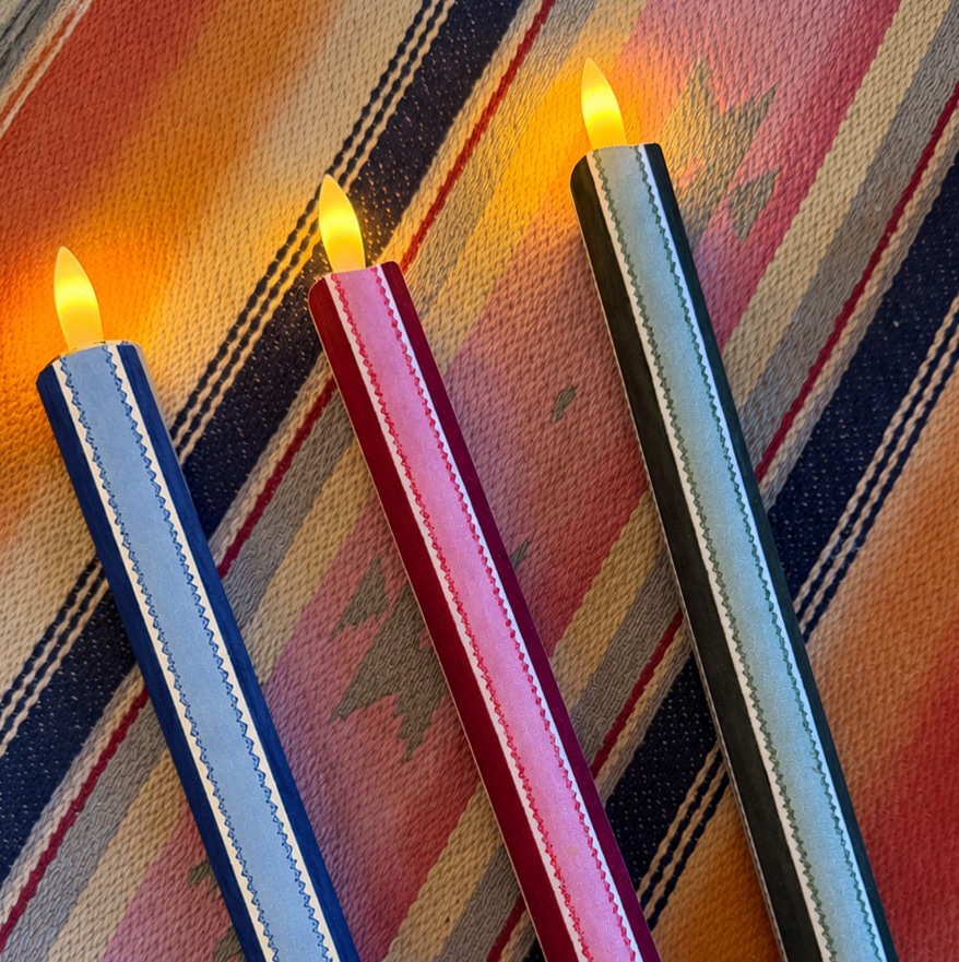
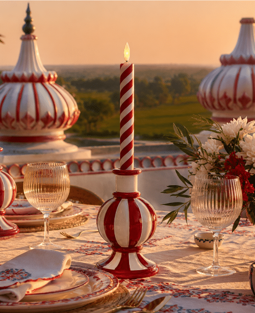
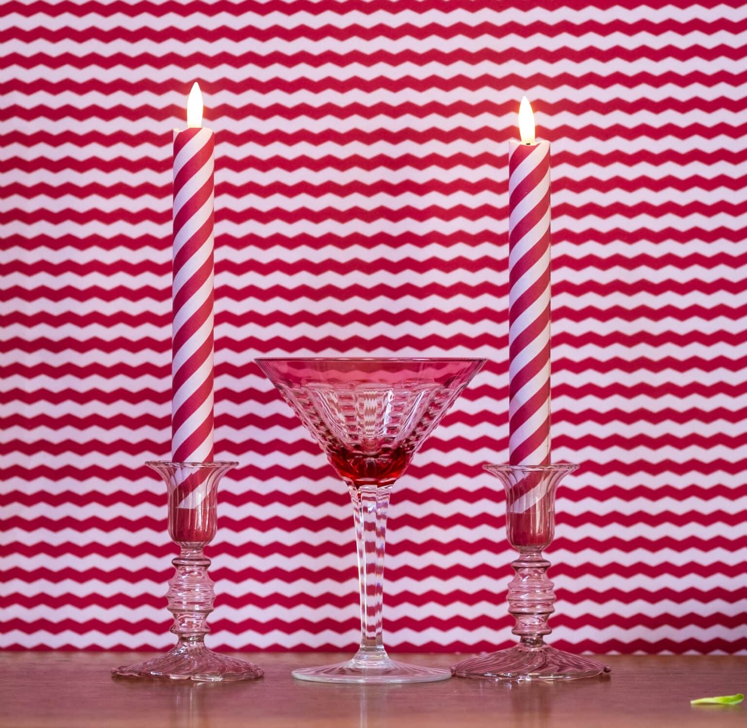
For spring, I love softer pinks mixed with fresh green, flowers and plenty of natural texture. Summer calls for something juicier: bowls of strawberries, raspberry napkins, striped candles, pink glassware and perhaps a splash of red or orange.

Pink tablescapes can be wonderfully romantic too, but I’d go beyond the obvious red roses. Blush linen with burgundy candles, dusky pink flowers and candlelight feels altogether richer. Or take things in the opposite direction with bubblegum pink, stripes and bright contrasting colours for a birthday or celebration.

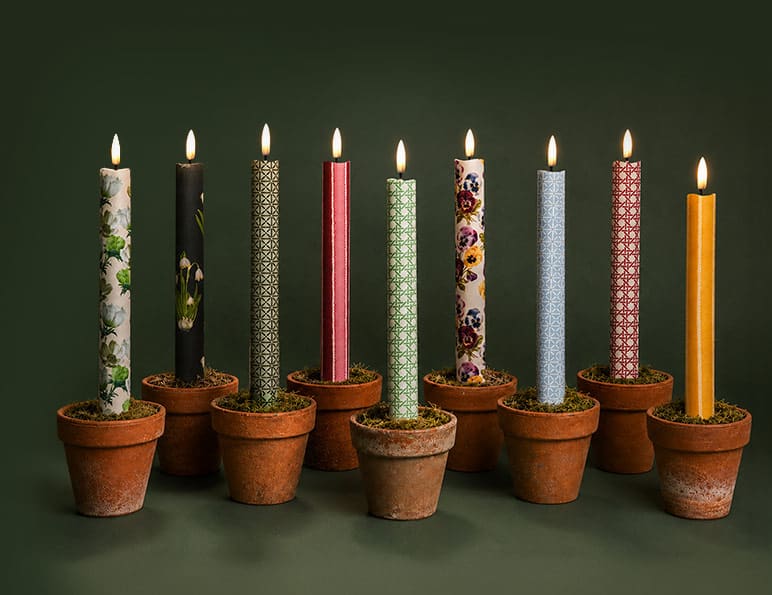
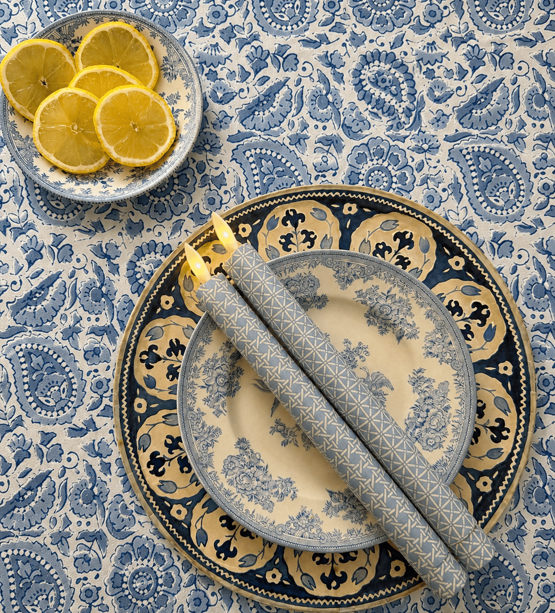
TINKALINK Taper Candles Hillcrest Flameless LED Wax Candles

Paint the town pink

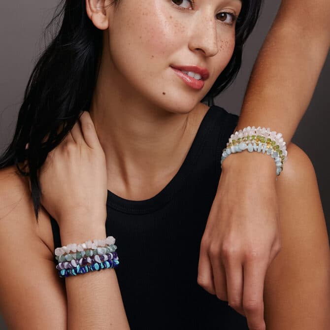
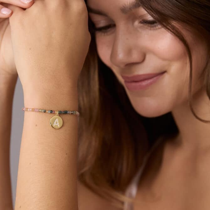
Pink is just as easy to wear as it is to bring into our homes. A favourite scarf, a flash of lipstick or the soft blush of rose quartz. Sometimes just a tiny pop is enough to change the mood.

In fact, rose quartz is traditionally associated with trust, compassion and harmony in our closest relationships,

Pink is one of those colours that instantly lifts a room — and sometimes the smallest pop makes the biggest impact.

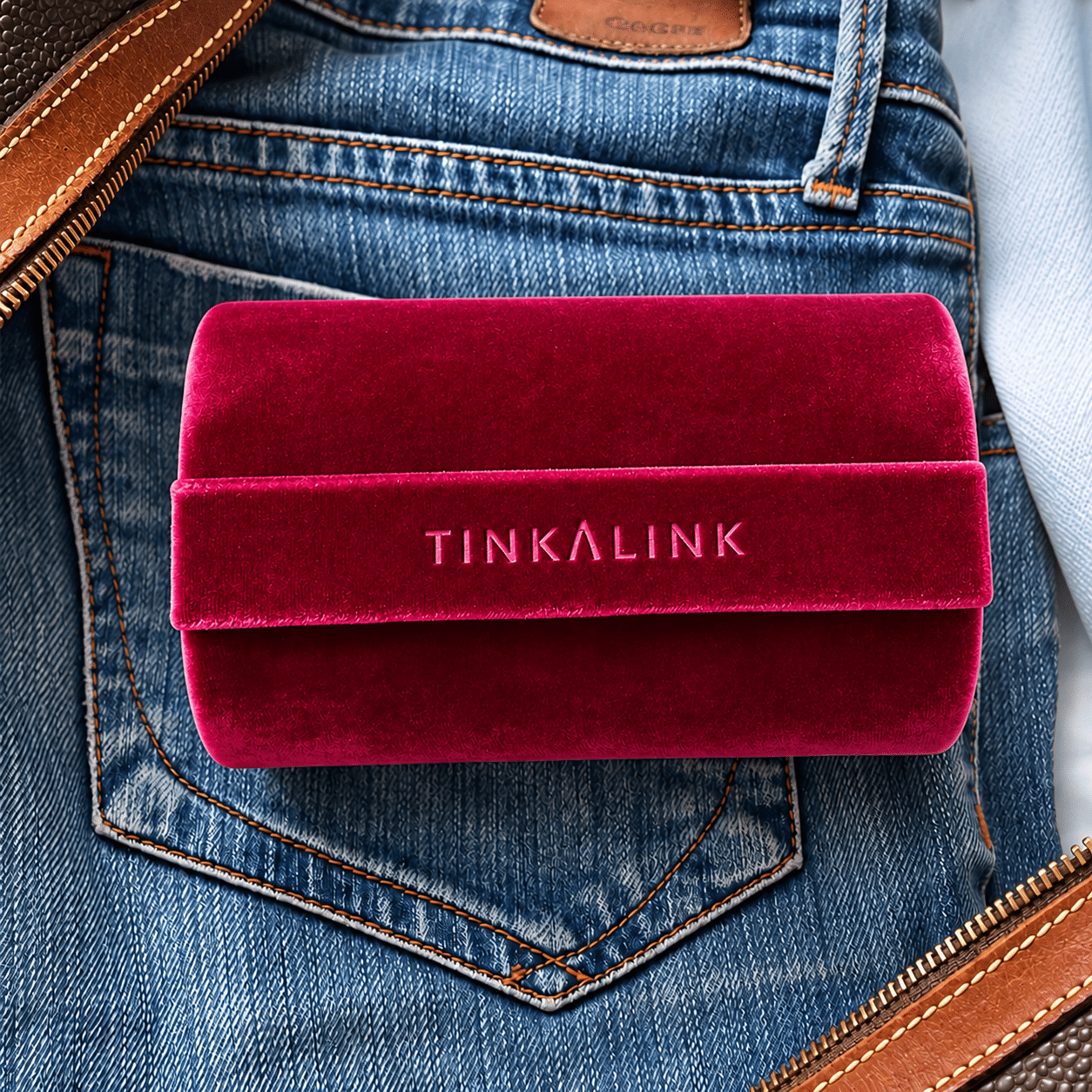
Our cerise velvet jewellery roll box brings a rich, jewel-like hit of colour to your dressing table or suitcase. Soft, tactile and beautifully sumptuous, it’s designed to keep your favourite bracelets, necklaces, rings and everyday jewellery safely tucked away, whether you’re at home or travelling.

Because practical doesn’t have to be boring — making it a particularly thoughtful gift,


THE TINKALINK PINK EDIT

[Pink candles / pink jewellery]

Explore more of our Notes on Colour series.

You might also enjoy

Contact us